About Us
Mission and Strategy
Constitution
Committee
Former Officers
The FILLM Logo
John Benjamins FILLM Prize

Updated: 11 March 2015
FILLM's visual identity is based on the federations's profile and values. FILLM aims to reach a multicultural audience across the globe which includes scholars from all sorts of backgrounds. This has been the inspiration for the federation's colours and its logo.
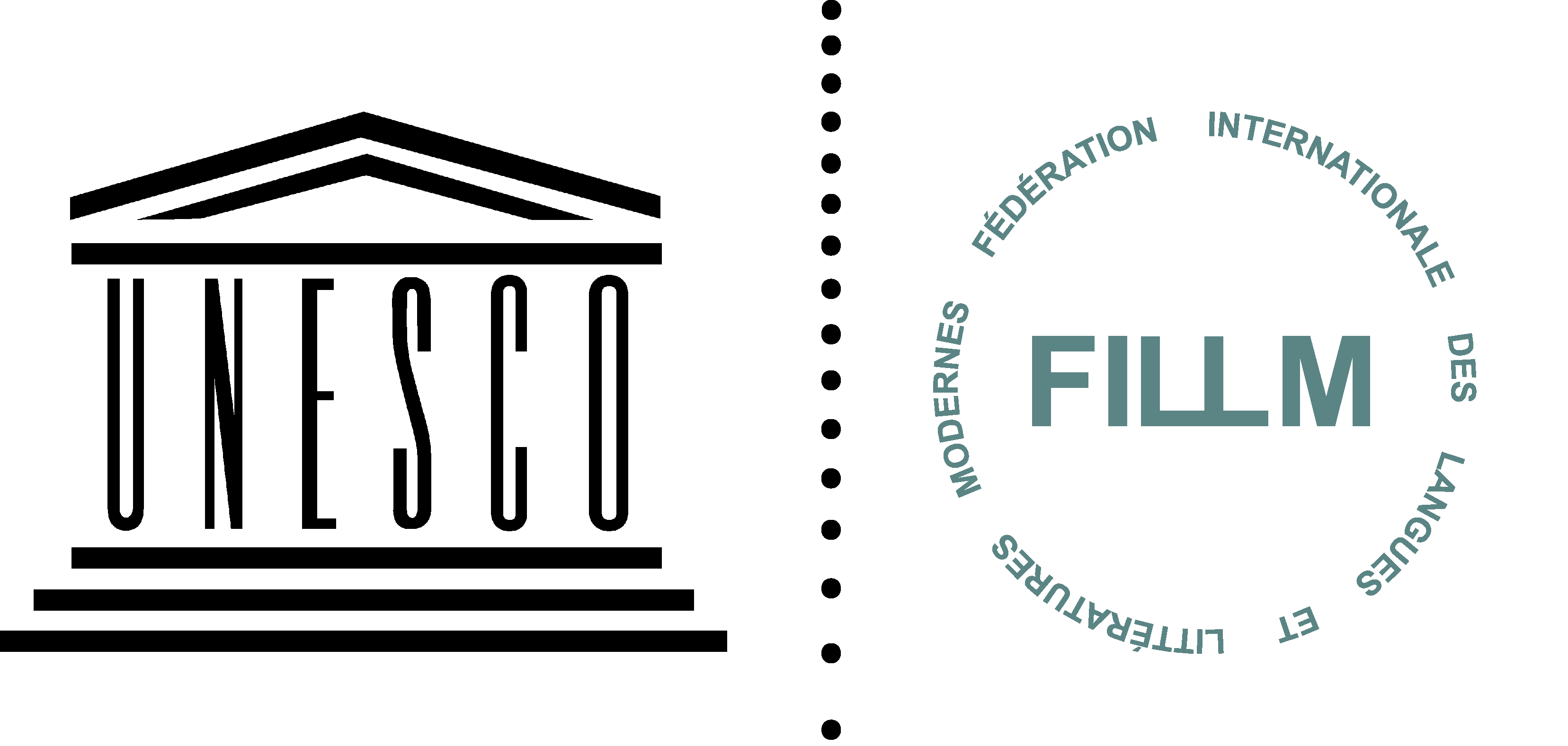
The FILLM logo consits of two elements: a cut circle and the word "FILLM". The circle symbolises the globe and the gaps the aim of reaching out to others. The logo is designed with a touch of playfulness while still remaining simple and stylish. The logo exists in two types: one in which the circle is made up of 'broken' lines (as shown on the right) and one where the federation's full name is given in the circle (see above).
The FILLM colors are green, light grey and dark blue. These colours have been chose because they are generally considered to represent confidence, respect, loyalty, stability and freshness, all traits which suit FILLM's values.
To know more about FILLM's visual identity, its logo and how to use it, you can download the "FILLM Identity Toolkit".
FILLM's visual identity and its logo have been designed by Martina Dahm. If you wish to see more of Martina's excellent work or get in touch with her, please visit her website.
If you wish to use the FILLM logo, please contact the federation's communications officer.
| ABOUT FILLM About Us Mission and Strategy Constitution Committee Former Officers FILLM Logo Benjamins Prize |
NEWS News Archive |
MEMBERSHIP Membership Members |
EVENTS Forthcoming FILLM Events Member Events |
PUBLICATIONS Recent Book Series Congress Proceedings FILLM Newsletter Others |
BLOGS Latest Posts Bloggers Archive Tags |
CONTACT Webmaster FILLM Committee Members |